Yes, yes, here is another post about Ai but this one hits different. It’s about accessibility, a term many folks are super passionate about (as they should) but few realize how time-consuming it can be. The time requirements will also increase with the quality, attention to detail, and depth that it is applied with. Just by addressing metadata text i.e. ALT text, the average person can take 30 seconds writing a meaningful description. What does meaningful mean? The learner gets the learning context the image conveys i.e. shape and size of a tool. Let’s start by recognizing that depth and the standards to uphold it.
Section 508 and Web Consortium’s Accessibility Guidelines (WCAG)
Section 508 refers to the Americans with Disabilities Act (ADA) and it’s a Federal requirement on any digital or print communication issued by the U.S. Government and related entities i.e. a contractor working on Federal contracts has to meet 508 requirements. WCAG it’s the “civilian” version of accessibility guidelines and it’s far more robust than its government counterpart. However, section 508 has been also updated to meet WCAG requirements but they are still different. Why? ADA came up first and when the Internet came up, 508 adopted electronic an digital formats.
Why should we do accessibility?
What is meant by “accessible” is that most folks, regardless of visual, hearing, or neurological impairment, is capable of navigating electronic media and websites. For that, designers need to describe media in its metadata i.e. a person with full visual capabilities can just see an image and infer context from it but a visually impaired person would need context clearly explained. For this, designers would edit the images metadata or what is known as ALT text.
What about color?
Thinking about accessibility, makes you think about many people and the struggles they may face. Color can be a challenge for someone that is color blind and can’t see the color red for example. That means that as a designer, you would need to avoid using color coding tactics and if you use them, also include a word mark or other clue such as text. Could that be why stop signs are red and also display the word? I don’t know but it could be a cool coincidence. The use of color also expands to how much contrast there is between the foreground and background elements i.e. the use of red against blue can cause vibrations or movement illusions of the eye plus make things hard to read.
How deep should we go?
Like most answers in LnD, it depends because “context” is the most important thing to discern. The basic requirements are ALT text, color contrast, and font selection. It can get way too convoluted and make training in specific contexts not functional. Therefore, it is paramount that we know when and how deep we need to go. You would not have to have such rigidity about accessibility if you know your audience and their personas or the occupational skills do not call for such level of detail i.e. training firefighters going over hose connections or emergency drills. These type of scenarios and many others just call for the two aforementioned areas of ALT text and color at the basic level.
Accessibility is necessary no matter what, but how deep we go, depends on these factors and project deadlines, resources, and specifics. Accessibility is wonderful, and the right thing to do, but also when it is truly needed.
ChatGPT for Accessibility
If you do not know ChatGPT, welcome back! I bet it was awesome being frozen all those years and no one to tell you anything about Ai. I envy you! Okay, Chat = chatbot and GPT = Generative Pre-trained Transformer, therefore, ChatGPT is one of the various Ai apps out there leveraging prediction schemes known as Large Language Models (LLMs) that have been “pre-trained” to have human conversations. If you just open ChatGPT for the first time, it knows nothing about nothing, but it will respond to your inquiries by predicting your language patterns, searching its available data, and the Internet. So, how can we use it for accessibility? You can do it directly by starting the conversation with this prompt:
“As an accessibility expert with deep knowledge of the latest WCAG and section 508 standards, you will provide the best ALT text when an image is uploaded. You will also provide a full analysis for accessibility when asked directly.”
Upload a image of your choice or this one.
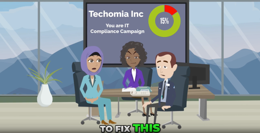
When you do that and upload an image afterwards, this is what should happen:
Three office workers sit around a conference table looking concerned while a screen behind them shows a Techomia Inc slide titled You are IT Compliance Campaign with a circular chart displaying 15 percent.
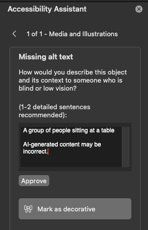
Let’s compare that to PowerPoint:
“A group of people sitting at a table.” I hope you can appreciate what is better. I have to mention that this is an improvement in PowerPoint too because not long ago, it could not process screenshots directly. It seems to be using Copilot (Microsoft’s GPT chat) these days but it still needs customization.
Summary
In summary, Ai is now capable of helping instructional designers expedite their accessibility work, humans that leverage it can do it and it does it better faster than most humans. You can do this with direct prompting in ChatGPT but it would be much better to use a custom GPT. Check out my LinkedIn post that shows results with a custom GPT.